
Hello! I’m Jon Iñaki, a cartoonist, designer, and board member of Big Pond Small Fish, and I’m going to take you on a deep dive into my process for designing BPSF’s logo.
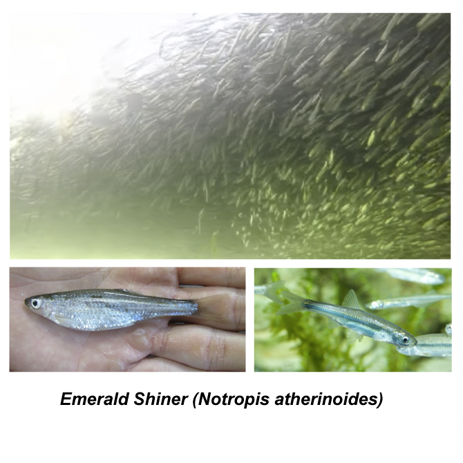
Making the fish in the logo a real and specific fish felt important to me, since BPSF ‘s projects have focused on engagement with nature . My research brought me to picking the Emerald Shiner, a small schooling fish endemic to Ontario. Green had always been the colour of the organization, for its association not just with nature but with inexperience.
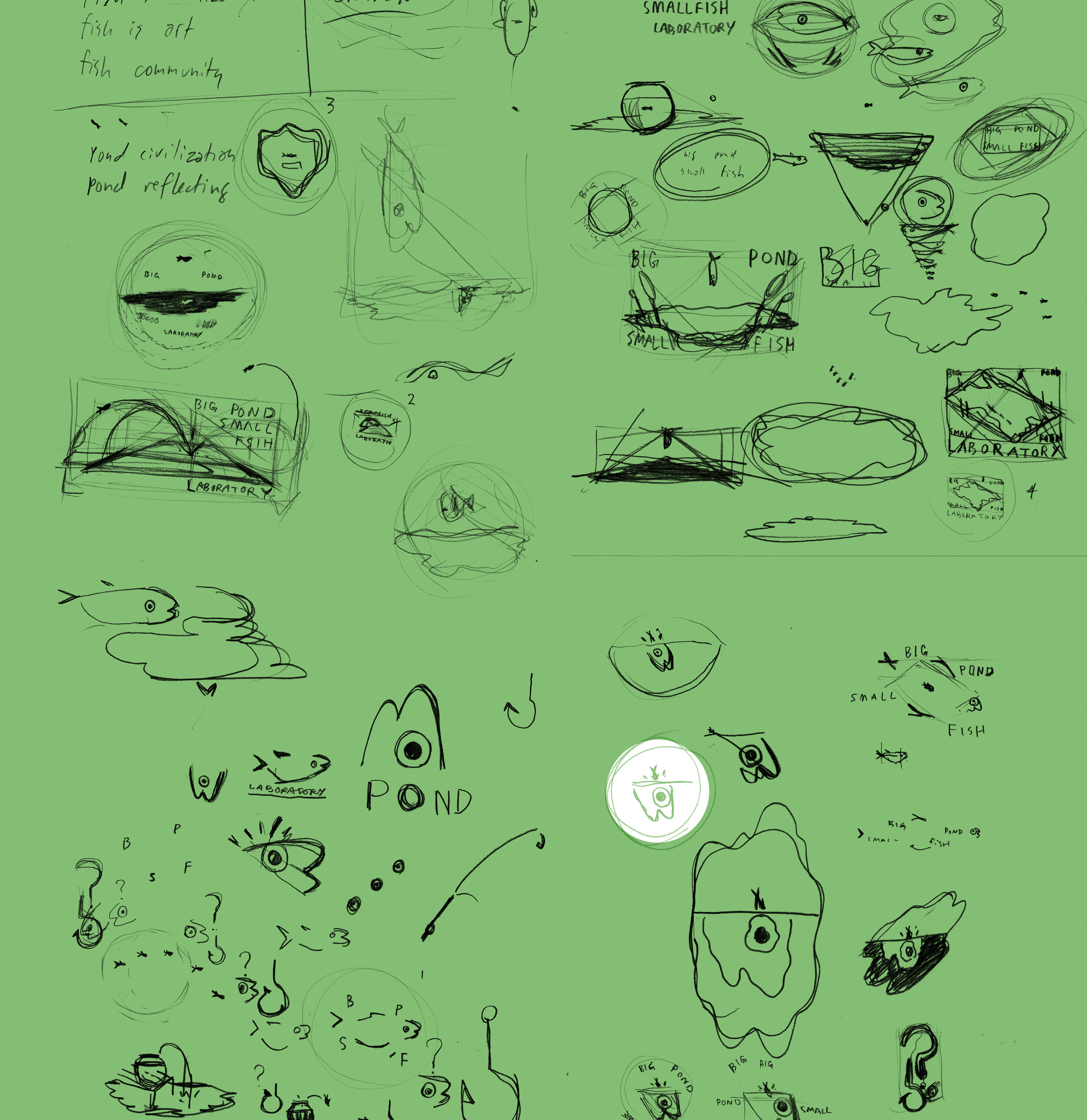
From pages and pages of initial sketches, a little wide-eyed guppy head leaped out at me. I toyed with it until I hit the idea that really spoke to the organization: the small fish being magnified as it enters a bigger world.

trying to nail the sketch down into a design means playing around and trying things that don’t work
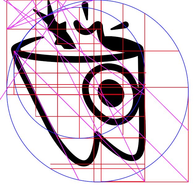
It’s important to test and build with a consistent internal geometry. One of the most important choices was to keep a playful sense of wobble in the eye.

The final choices were to make the splash balance between liveliness and legibility, and where to keep the design open or closed, which really change the flow of energy.
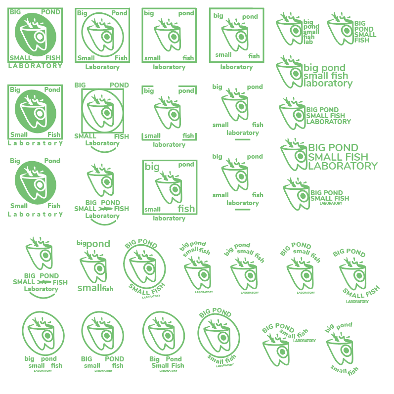
Now I had to work out how to integrate the text with this logomark. My initial instinct was a four-words/four-corners choice, but I abandoned it — it felt wrong to have something so structured and bounded. Instead, I chose two choices with different utilities: an iris mirroring the fish’s eye, and a banner balanced against the vertical line in the right of the logo, which made a pleasing ascendant line.
I guess one interpretation could be that conceptual art will make your brain balloon and throw you into a bigger world with a huge splash. I know that’s how it felt for me.
I’m very proud of the “Shiner” logo, and how it embodies the spirit of our organization, with a sense of wonder and play.